Applying Machine Learning algorithms and “doing AI” is only a (relatively) small part of the whole process of modern data analysis.
As I have mentioned maybe a few times by now, a much bigger part of it all has to do with gathering, cleaning, “munging”, and then understanding and visualizing. Modelling usually cannot happen before that (unless you’re lucky and you’ve been provided with a clean dataset…).
To make a point
There are many ways data can be messy. A few such cases can be:
- Missing value
- Incorrect value
- Encoding issues (not everyone uses UTF-8)
- …
And well: many other “data quality” concerns. So let’s have a look quickly today at the concept of treating human-generated data, which quite possibly will not be as perfect as one would expect upfront.
Let’s take a very simple (and by the way real-world) example:
A colleague of mine has dealt with gathering data from several Excel files gathered from different teams. So far, so good: A typical “Excel Chaos” scenario. He then wanted to put together that data and do reporting on it.
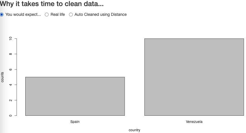
Say one wants to “merge” such different Excel tables (even gathered with the same template). Still a very reasonable objective. And for example, one might want to merge on the “country” variable (why not). Or even simpler: Count the entries of things “per country”, even from ONE CSV file.
One would expect to be able to draw something like that:
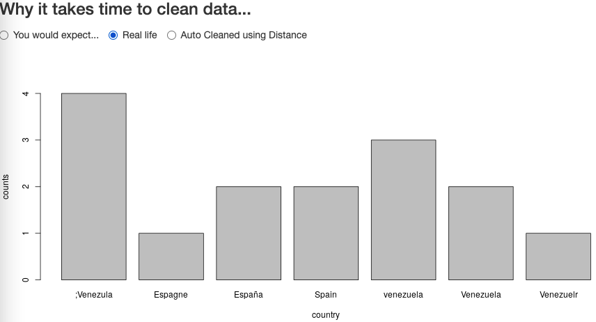
However, because the template was too generic, and different teams were free to fill in the templates the best way they knew, one could have ended up with something like follows:
My colleague then ended up doing lots of manual cleaning of the gathered data before being able to report on it. Let’s look at an automated alternative to try and clean that data as much as possible.
First, one needs to have a “base set” of valid countries names. Then, using a “spelling distance algorithm”, one could compile a cleaned list of countries. There are several such distance algorithms, one of the most common ones being the “Levenshtein Distance”. Let’s have a look at the “fixed” output:
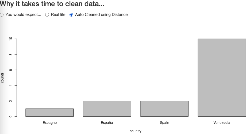
Not bad. As can be observed, our “trick” will not be perfect (there is no telling how one can choose automatically, using the above, the alternative “USA” for “The United States”, “The United States of America”, etc.). So some processing will still need to be more detailed, and less “automagical”.
For instance in the example above, Spain was written (for whatever reason) as España (Spanish version of the word) and Espagne (French version). Restricting acceptable distance to avoid mis-correcting being important, one can then only resort to a dictionary-based mapping. So one would have to compile maps of translated versions of each country name, and THEN map to the English version of the nearest acceptable spelling
The code for today
As is usually the case, there are libraries to do the above readily available for R programmers like us. I chose the “stringdist” library (after checking for which to use through online search). The default “distance algorithm” used by stringdist is called “Optimal string aligment, (restricted Damerau-Levenshtein distance)”. I haven’t tested for too many use cases so I don’t know if the other options are better suited in this and/or other cases, but it worked fine in my demo.
library(shiny)
library(stringdist)
library(dplyr)

countries_clean <- c("Venezuela", "Spain")
countries_dirty <- c("Venezuelr", "venezuela", "España", ";Venezula",
   "Espagne", "Spain", "Venezuela")
v1 <- data.frame(country = countries_clean, counts = c(10,5))
v2 <- data.frame(country = countries_dirty,
   counts = c(1,3,2,4,1,2,2))

base_countries_list <- c("France", "Spain", "Venezuela")

choose_nearest <- function(to_be_cleaned, base_set) {
   t_distances <- sapply(to_be_cleaned, function(x) {
      t_dists <- stringdist(x, base_set)

      if(length(t_dists[t_dists < 3])) return(base_set[t_dists < 3])

      return(x)
   })

   t_distances
}

v3 <- data.frame(country = choose_nearest(v2$country, base_countries_list),
   counts = v2$counts)
v3 <- v3 %>% group_by(country) %>% summarise(counts = sum(counts))

ui <- fluidPage(
   fluidRow(radioButtons("radioB", h3("Why it takes time to clean data..."),
      choices = list("You would expect..." = 1,
         "Real life" = 2,
         "Auto Cleaned using Distance" = 3),
      selected = 1, inline = TRUE)),
   fluidRow(plotOutput("countriesCounts", height = "400px"))
)

server <- function(input, output) {
output$countriesCounts <- renderPlot({
      if(input$radioB == 1) { with(v1, barplot(counts ~ country, ylim = c(0, max(counts)))) }
      if(input$radioB == 2) { with(v2, barplot(counts ~ country, ylim = c(0, max(counts)))) }
      if(input$radioB == 3) { with(v3, barplot(counts ~ country, ylim = c(0, max(counts)))) }
   })
}

shinyApp(ui = ui, server = server)
Conclusions
Hopefully, the spelling distances trick will help us fix a few “human errors” (errors which are only natural, but not great for a PC to work with the data ;)), faster than by manually reviewing each entry (think thousands of lines of data).
Too much attention is given to “Machine Learning” itself, and maybe not enough to the data quality issues (and quantity, and variety, and…). The Data Engineering problems (traditional “ETL”, if you wish) are (often times) at least as important , and often more time consuming, than the actual “analysis” itself.
And I just wanted to make a note about this for today 🙂