Intro
As I said last week, I am a bit short on spare time lately (I have a couple of other goals, on top of my job and this Blog, and a couple other hobbies…). So I’ll try to make it short this week.
This is definitely “mostly for marketing”. As an engineer, I tend to not care too much (not enough, that is) about how beautiful the visualization is. Note that I care a great deal about not being lied to with a visualization, and sometimes the aesthetics are used precisely to fool you. But that’s another story.
Most of the time I use only a few visualizations: Timelines, scatterplot, barplot, network graphs, maps, and maybe a few others (boxplot, densities, ROC…). I use those because they help ME understand the data, the model, or whatever I am trying to do.
But a little effort won’t kill me. And having all the data gathered, all the wrangling, cleaning, merging/joining, counting, exploring, regressing, modelling, simulating, training, testing (etc., all the analysis stuff), having all that if I won’t be able to transmit the results in a slightly attractive fashion, well… Maybe it’s a pity.
So two quick exercises won’t be lost effort after all, will they?
Thank you Mr Rudis for the Waffle
I often come across some Square Pie Charts (a.k.a. waffles, which makes sense!), and I have always hated “Traditional” Pie Charts (I have bought early on into the idea that they don’t convey the proportions the way they intend to).
So waffles it is. How would I go about that… Maybe splitting some data.frame rows, then using ggplot with squares… I mean I have done a bit of that already in the past, how hard can it be to get to a basic “waffle”?
Wait, what am I even doing? There must be a package out there to do just that, right?
Of course there is. (There might be other packages for the same objectives, I haven’t gone the extra mile to look for it).
I hope he won’t mind, but I would like to thank Bob Rudis for his valuable R expertise. It’s not the first time he helps me with my “R for Security Data” initiative: As I have mentioned in the past,one of his books is on my shelf (it has been there for a while and has proven useful a few times already). (I’m still more impressed by Mr H. Wickham’s tidyverse, RStudio & al., but Mr Rudis is right there in the shortlist of best R references for my goals. Plus, Mr Rudis works in IT Security, or so it shows on his Github account – I don’t want to stalk him – I’m just glad to see others care about data analysis with R for security data). But I’m getting lost here, let’s get back on topic.
Long story short: I came across this package:
https://github.com/hrbrmstr/waffle
And it made my day.
It took a few minutes to re-construct my Docker container to add this (and a few other packages).
Note: If you’re interested, I’m working with the following Dockerfile these days for my RStudio environment (rocker has replaced Ubuntu for now…):
FROM rocker/rstudio

RUN R -e "utils::install.packages('devtools')"
RUN R -e "utils::install.packages('plyr')"
RUN R -e "utils::install.packages('tidyverse')"

RUN R -e "utils::install.packages('mongolite')"
RUN R -e "utils::install.packages('jsonlite')"
RUN R -e "utils::install.packages('XML')"

RUN R -e "utils::install.packages('e1071')"
RUN R -e "utils::install.packages('rpart')"
RUN R -e "utils::install.packages('nnet')"
RUN R -e "utils::install.packages('dbscan')"
RUN R -e "utils::install.packages('iptools')"
RUN R -e "utils::install.packages('Rwhois')"
RUN R -e "utils::install.packages('bitops')"

RUN R -e "utils::install.packages('visNetwork')"
RUN R -e "utils::install.packages('wordcloud')"
RUN R -e "utils::install.packages('plotly')"
RUN R -e "utils::install.packages('ggthemes')"

RUN R -e "utils::install.packages('emojifont')"
#RUN R -e "utils::install.packages('waffle')"
RUN R -e "devtools::install_github('hrbrmstr/waffle')"
This is my “new” Dockerfile (I have started working on it in 2021), so it is missing a few things I haven’t used yet, but I want to see how it grows only as needed. Pretty straightforward stuff. For now (about a week into January*), it’s nice. And I’m adding new packages on the go.
Anyhow.
* Yes, this post seems to be published late. Because I have extra work, I am scheduling the publishing of the Blog posts so that I try to stick to “one entry published per week”. That’s not the same as “one entry created from scratch per week” 😉
You’ll notice I install from GitHub for the waffle package. I wanted the latest version, and CRAN didn’t seem to have that the day I tested all this. That’s all.
OK so what about the results? I just did a few quick tests, the ggplot and geom_waffle mix is a bit more elaborate (I just replicated some sample code from the package’s owner ;)).
# Playing with new visualizations...
library(dplyr)
library(ggplot2)
library(waffle) # New arrow for my quiver
library(emojifont) # New arrow for my quiver

# Testing waffle package from Bob Rudis
# Much inspired from his demos at: https://github.com/hrbrmstr/waffle
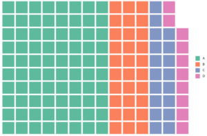
parts <- c(80, 30, 18, 10)
waffle(parts, rows = 10)

Really, that easy: 1 line. That’s “automagical” (Implementing just that from scratch would have taken me quite a few lines, most probably). That’s the magic of using packages. Let’s build on this first test.
waffle(parts, rows = 5, flip = TRUE)

Fair enough. You can also use dataframes for input (I’m guessing you’ll need the correct column names, but I haven’t investigated much just yet). One note: It seems to be necessary to have the names variable as Factors. I found out looking for other tests out there, and replicated a working example that forced the factor type. That fixed the issue and the below lines seem to work for me:
parts <- data.frame(
  names = factor(LETTERS[1:4]), # Must be factor! Otherwise doesn't seem to work
  vals = c(80L, 30L, 20L, 10L)
)
waffle(parts, rows = 8)
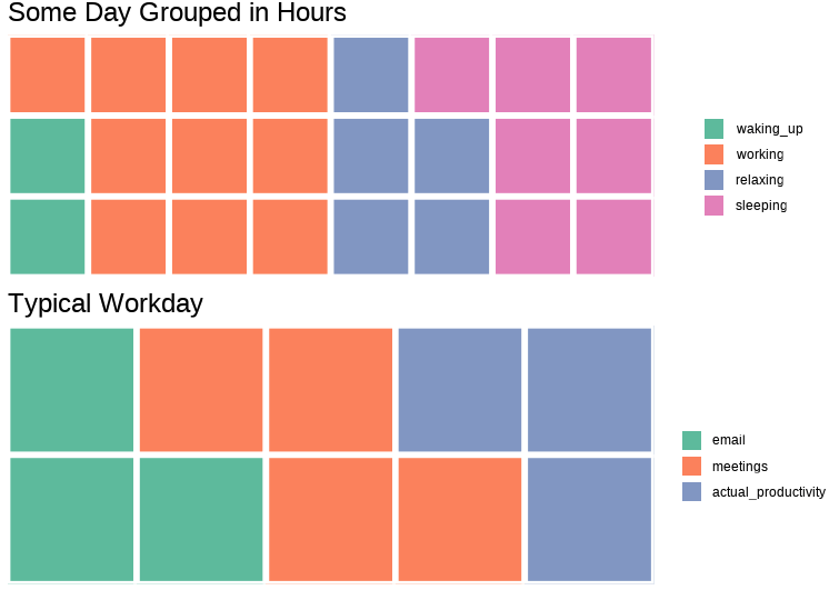
Finally the “iron” stuff is nice, it definitely help put different waffles together neatly:
iron(
  waffle(c(waking_up = 2, working = 10, relaxing = 5, sleeping = 7), rows = 3,
    title = "Some Day Grouped in Hours"),
  waffle(c(email = 3, meetings = 4, actual_productivity = 3), rows = 2,
    title="Typical Workday")
)
Producing this (it’s just an example, don’t make it personal ;)):

Not bad, and objective covered: I can now produce “waffle” plots.
Emojis
If you ask me, this doesn’t add real value. But I must be getting old. As everyone else, I DO use emojis (all the time), gifs, videos, to transmit information. My preferred ones are the “:thumbup:” and the “:thinking_face:” in Telegram. And it’s useful, a couple of clicks and you can (sometimes) transmit more information than by typing more text. So you know, I don’t think emojis are bad per-se.
Plus if it’s going to make thing look more elaborate… But sometimes I have my doubts…
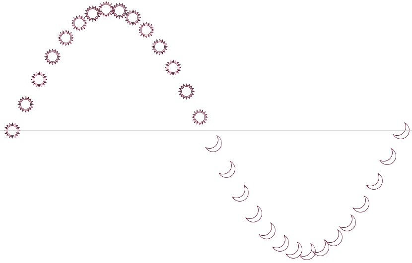
For instance I came up with this:

Yes, it looks somehow like Day and Night (and by the way, one must have some intuition here, that night for whatever reason corresponds to moon, below some line…). Also, there are 30 entries, not 24… ¿?
Well, that’s because the data has nothing to do with night and day. It’s all misleading. It’s a sine curve, starting at 0, for one full cycle, and choosing Suns for “positive” and Moon for “negative” (with 0 being more of a judgement call, but that’s not the point):
x <- seq(0, 2*pi, length=30)
y <- sin(x)
ggplot() +
  theme_void() +
  geom_emoji(c(rep("sunny", 15), rep("crescent_moon", 15)), x=x, y=y, size=10) +
  geom_hline(yintercept = 0, colour="lightgrey")
Actually, visually it’s still a sine wave, but it’s also saying something else (albeit clumsily, yes).
I guess I shouldn’t worry about it. For today, what’s important: one can use some simple libraries to make good graphs look “better” – not always adding actual value beyond visual attractiveness, but again, maybe it’s not always the worst thing.
Although… Some might argue that it is (I probably would count myself among them):
If supplementary visual information distracts from the goal of a graph, it shouldn’t be there. But tell that to the boss that doesn’t want basic black on white scatterplots, and prefers some beautiful histogram with the company colours…
So I guess the point should be to make some graphs, of the right type for the right objective, clear and with the right data, but then one can consider how to make them a bit more beautiful, AS LONG AS it doesn’t impact the informational message.
Conclusions
Very little code for some visual results, which was the objective. Two more things I can use (some day).
I’ll just make sure I keep this somewhere for later use. (That is, my GitHub account. It’s starting to look more and more like my backup for code, if nothing else… Oh well. I hope nobody gets bothered by a bit of messy code out there…)